This project formed part of the assessment for my Professional Certificate in UI Design at the UX Design Institute. The fictional client created by the institute was a new challenger bank.
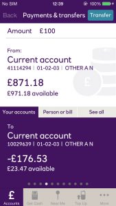
The task was to develop a responsive design system and visual identity for this new challenger bank, incorporating the client's three brand values of trustworthiness, clarity and playfulness. In addition to creating a visual identity I had to create three screens of a banking app/website.
For this project I had the luxury of coming up with a brand name. After a lot of brainstorming I chose Koti, which is the Finnish word for home. The idea was that this challenger bank was going to be the home of the user's money, their financial home.
For this project I have created a short video explaining some of my design thinking.
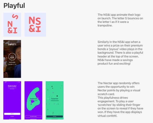
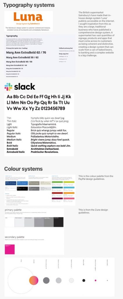
I created multiple digital moodboards, some mood boards were based on the client's brand values, ; playful, trustworthy and clear. I drew a lot of inspiration from the Nectar reward points app that had been developed by British supermarket Sainsbury's. A traditional company had developed a modern and playful app for managing reward points.
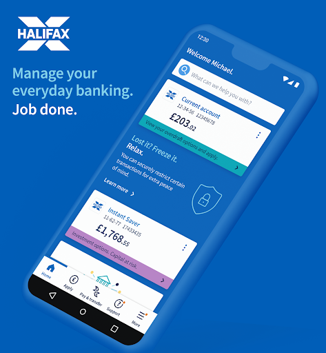
This new challenger bank would be competing against traditional high street banks like NatWest and Barclays but also existing challenger banks like Tide and Revolut.

After examining the design systems of several competitors I made several key observations.
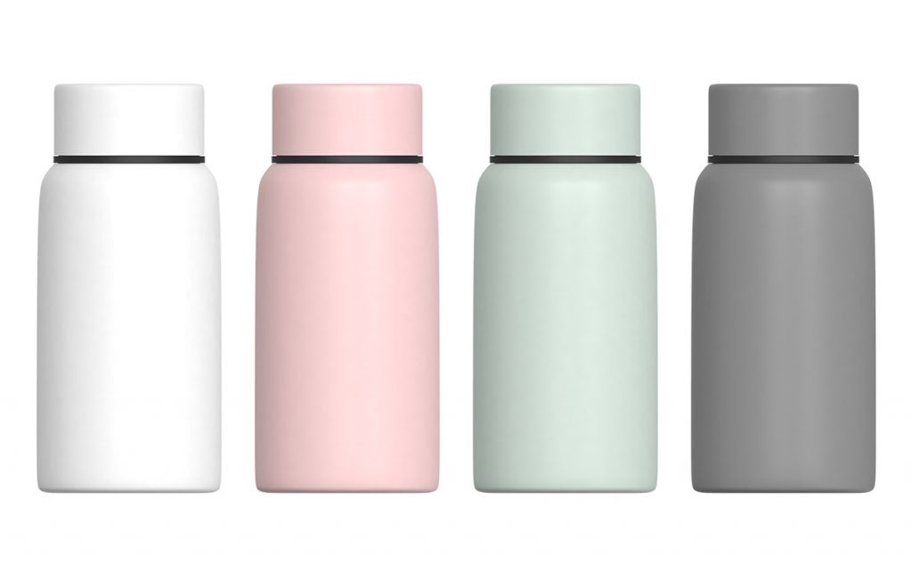
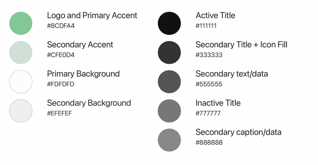
For the colour palette I drew inspiration from the increased use of pastel colours in interior and product design. The accent colours are a mid and light pale green. Green is a colour associated with money, but the shades I selected also have a home-earthy feel.
I used a blend of light and dark greys to create a clean aesthetic with a strong sense of hierarchy. A colour system that is also sensitive to the needs of colour blind people.
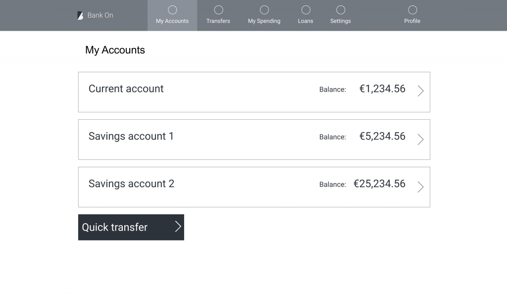
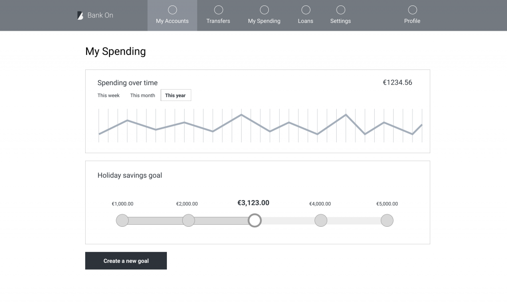
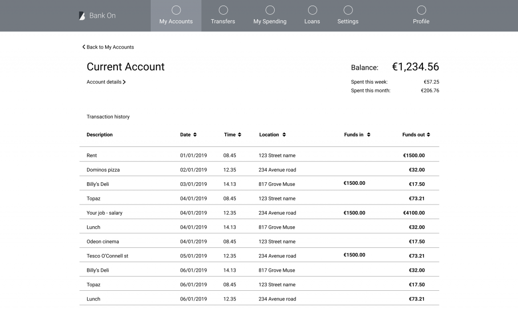
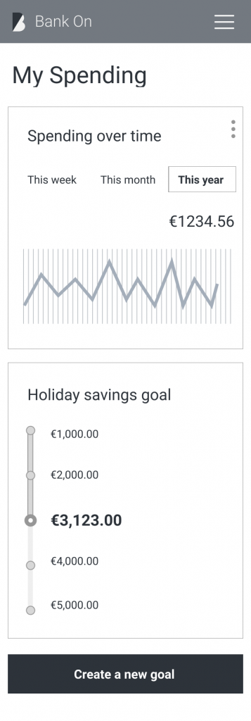
Wireframes were supplied both desktop and mobile. These were to be the starting point of the app & responsive website.