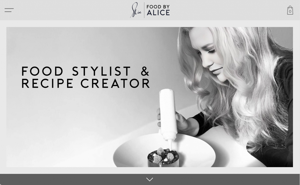
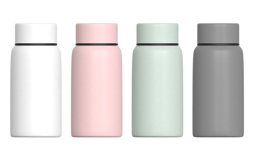
Food by Alice is an award winning food stylist and influencer with 11,000 followers.
Task
For this project I was tasked with three things
Create a visual identity and brand that could be used on a responsive website, social media and packaging
Design a modern e-commerce website with two goals 1) Highlight Alice's food story 2) Allow Alice to sell her prints online
Developing the visual identity
Sources of inspiration
Koti
Overview
Context
This project formed part of the assessment for my Professional Certificate in UI Design at the UX Design Institute. The fictional client created by the institute was a new challenger bank.
Task
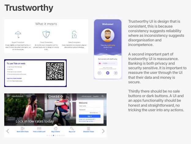
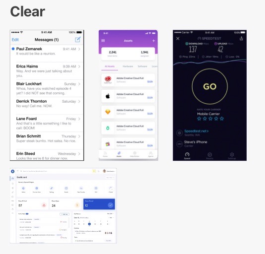
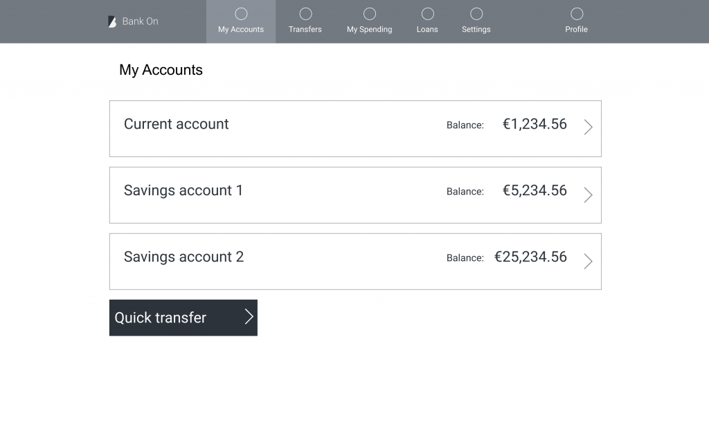
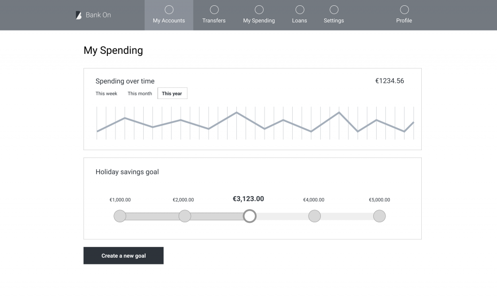
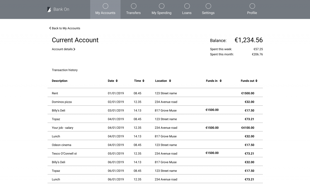
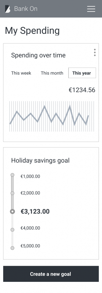
The task was to develop a responsive design system and visual identity for this new challenger bank, incorporating the client's three brand values of trustworthiness, clarity and playfulness. In addition to creating a visual identity I had to create three screens of a banking app/website.
It's all in a name
For this project I had the luxury of coming up with a brand name. After a lot of brainstorming I chose Koti, which is the Finnish word for home. The idea was that this challenger bank was going to be the home of the user's money, their financial home.
Video
For this project I have created a short video explaining some of my design thinking.
Developing the Visual Identity
Moodboard
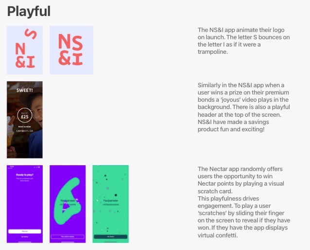
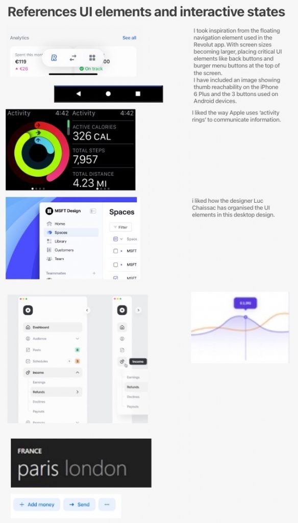
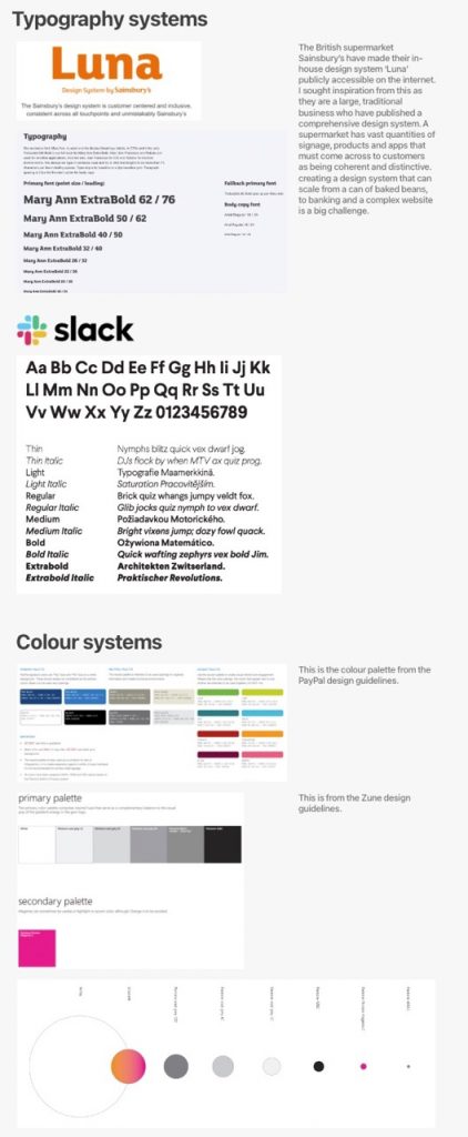
I created multiple digital moodboards, some mood boards were based on the client's brand values, ; playful, trustworthy and clear. I drew a lot of inspiration from the Nectar reward points app that had been developed by British supermarket Sainsbury's. A traditional company had developed a modern and playful app for managing reward points.
Competitors
This new challenger bank would be competing against traditional high street banks like NatWest and Barclays but also existing challenger banks like Tide and Revolut.
After examining the design systems of several competitors I made several key observations.
Most financial institutions use blue and or purple for their branding. To develop a new design system and brand that stands out I should use a different colour.
Traditional banks design systems are very corporate looking. Whilst this can be useful in conveying trustworthiness a rigid corporate style design would be inappropriate for a progressive challenger bank focused on consumers.
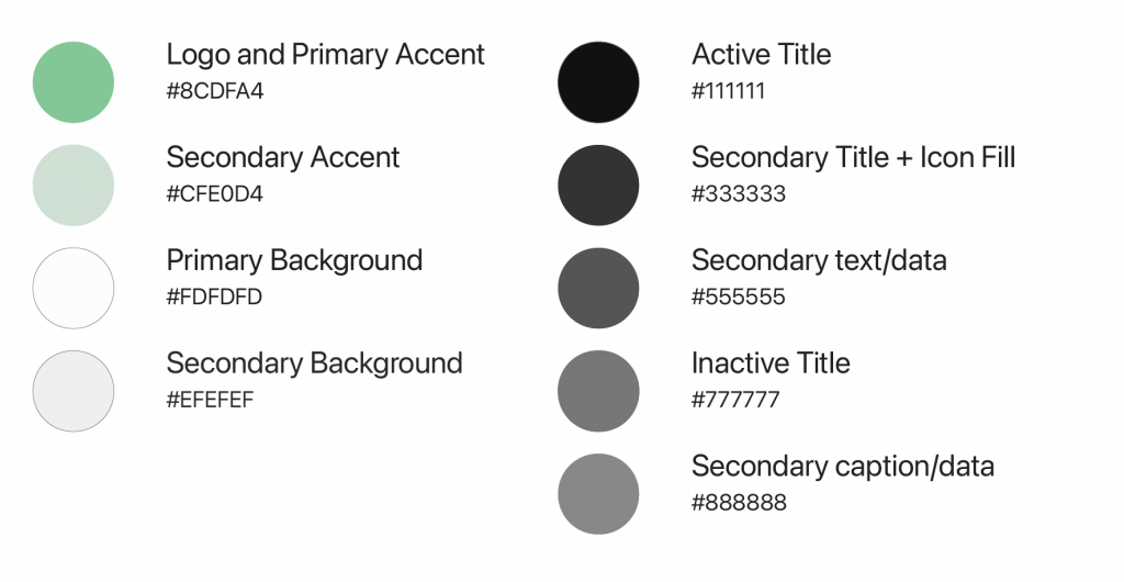
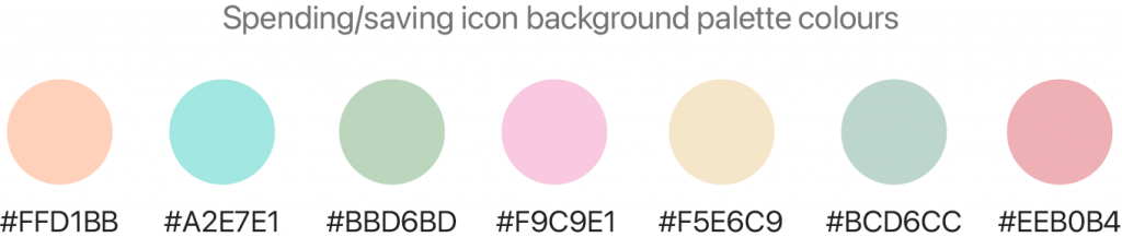
Colour Palette
For the colour palette I drew inspiration from the increased use of pastel colours in interior and product design. The accent colours are a mid and light pale green. Green is a colour associated with money, but the shades I selected also have a home-earthy feel.
I used a blend of light and dark greys to create a clean aesthetic with a strong sense of hierarchy. A colour system that is also sensitive to the needs of colour blind people.
Developing different screens
Wireframes
Wireframes were supplied both desktop and mobile. These were to be the starting point of the app & responsive website.
Final Design
XD Prototype LInk
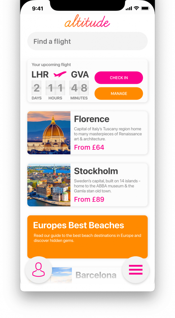
Altitude
Overview
Context
This project was created as part of my UXDI course. The client was a start-up airline looking to create a mobile app that provides a fast, easy and intuitive experience. One that’s based on a deep understanding of their target users.
Task
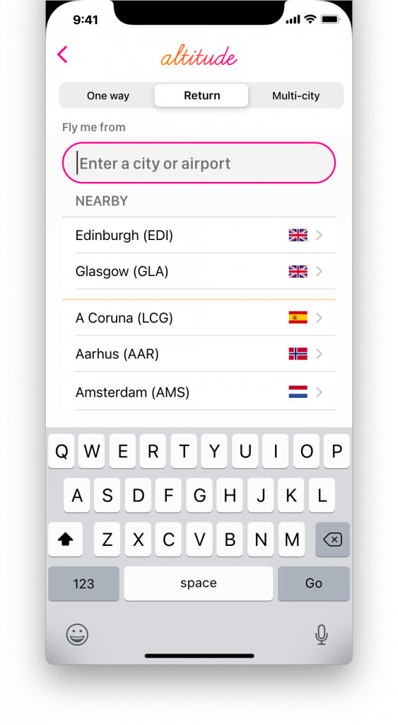
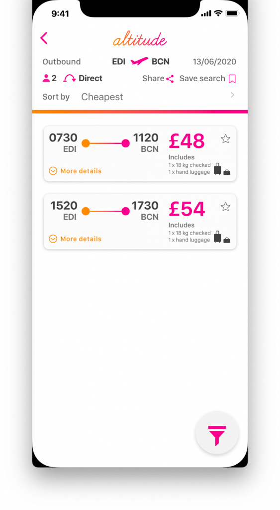
Create a mobile app, specifically focusing on the flight booking process; how users search and select flights online.
Research
Methodology
Survey, Competitive Benchmarking, User Testing, User Interviews
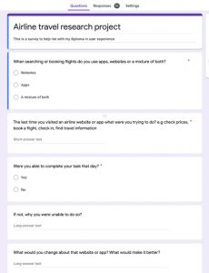
Survey
Research Objectives
• Find out how people prefer to access airline prices • Find out paint paints and negative experiences with existing apps • Find out the improvements people want to see in travel apps
Participants
52 people took part in the survey, hosted on Google Docs. Friends and people from different Facebook groups were invited to take part.
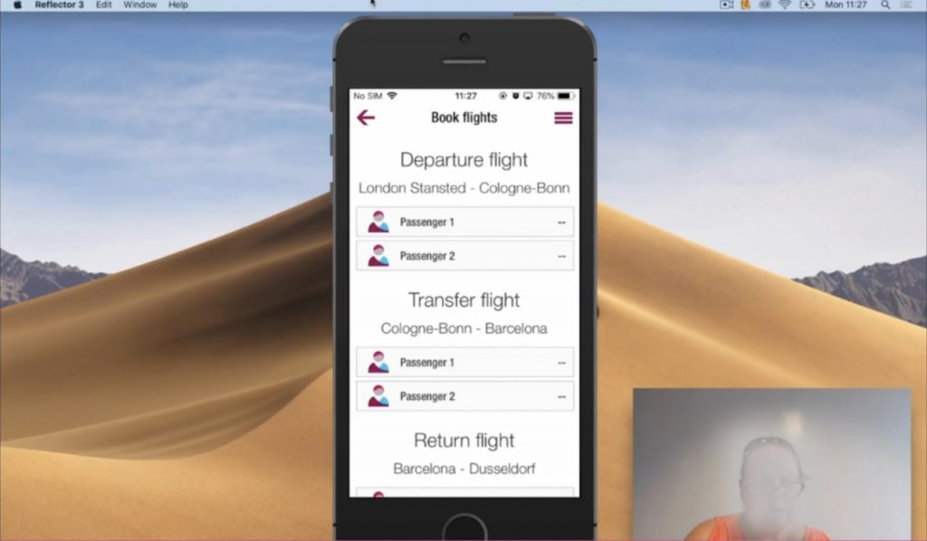
User Testing Sessions
User testing sessions were carried out looking at existing flight and travel apps. At the beginning of the sessions an interview was also carried out. I then played back the recordings of the sessions, documenting highlights from the interview and making detailed notes as each user undertook the set tasks.
Analysis
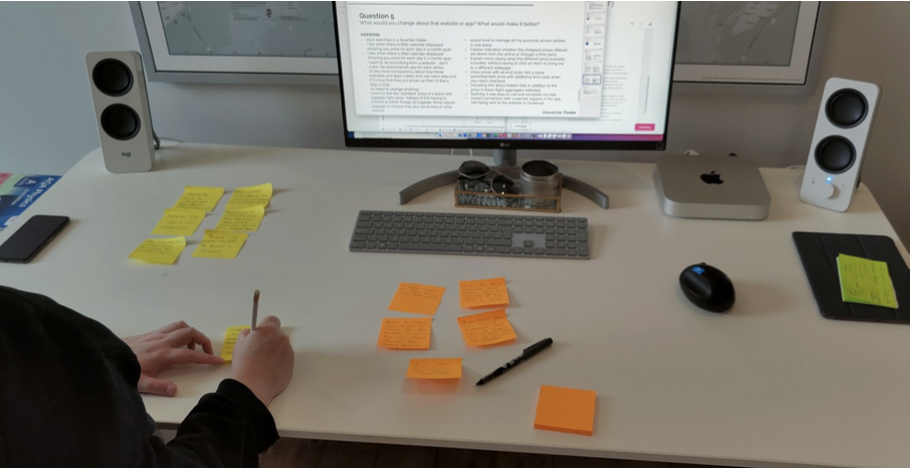
Affinity Diagram
Objectives
Review previously completed research
Consolidate previous research from online survey, note taking and user testing sessions.
Organize qualitative data in a structured way.
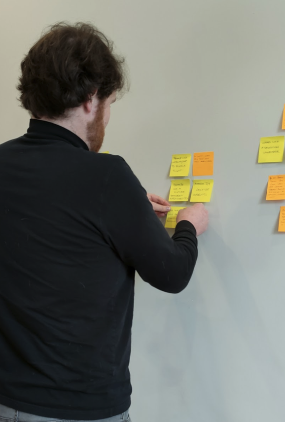
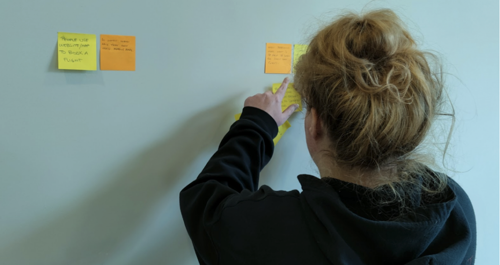
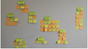
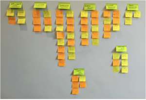
Stage 1 - Research was reviewed and each observation was recorded on a sticky note.
Stage 2 - Sticky notes were then organized into relevant groups
Stage 3 - Names were found for each of the groups and these were then placed into chronological order.